Sunday, February 24, 2013

Sculptures of Bulls at the Metropolitan Museum of Art

By Charles Kessler

Often, as if there's a theme for the day, one thing or another seems to stand out when I visit a museum. I already wrote about how one day I noticed the backs of sculptures; another time I spotted what I called the "awww, how charming" motif; and once, at the National Gallery, several of the paintings suddenly struck me as hilariously funny. And now, on my latest trip to the Metropolitan Museum of Art, I noted a surprising number of sculptures of bulls.

It makes sense that bulls would be depicted a lot since they're large, powerful animals that demand attention, and they're vitally important to agrarian societies. But the way bulls were portrayed in ancient times was very different from the terrifying, sexually aggressive monsters that Picasso and other modern artists created.
Pablo Picasso, Dying Bull, 1934, oil on canvas, 13 ¼ x 21 ¾ inches (1999.363.67).
The bull sculptures I saw at the Met seemed calm, contented and sometimes even playful. Perhaps pre-modern people were more at ease with nature, including their own animal nature, than we have become.

So here, in chronological order, is a selection of my favorite sculptures of bulls currently on view at the  Met. I included the acquisition numbers in the captions so you can easily find more about them in the Met's comprehensive collection database.
Kneeling bull holding a spouted vessel, Southwestern Iran,  Proto-Elamite,  ca. 3100 - 2900 B. C., silver, 7 x 2 ½ x 4 ¼ inches (66.173).
Standard with Two Long-horned Bulls,  Central Anatolia, Early Bronze age ca. 2300 - 2000 B. C.,  copper alloy,  6 ¼ x 5 ¾ inches  (55.137.5).
Bull's head, Mesopotamia, Neo-Sumerian, ca. 2100 - 2000 B. C., steatite or serpentine, 2 ½ x 2 ¾ x 2 ⅔ inches (1973.33.2).
Vessel terminating in the forepart of a bull,  Hittite Empire,  Central Anatolia,  ca. 14th - 13th century B. C.,  silver,        7 x 5 x 8 ½ inches (1989.281.11). 
Terracotta bull,  Mycenaean, Late Helladic IIIA,  ca. 1400 - 1200 B. C.,  3 ¼ x 4 ½ inches (36.11.6)
Bronze bull, Late Minoan III,  ca. 1400 - 1200 B. C. or later, 2  3/16 x 2  5/16 inches (26.31.492). 
Bull, Southwestern Arabia, ca. mid-1st millennium B. C.,  bronze, 8 ¾ high (47,100.85).
Standing Bull, Southwestern Arabia, ca. mid- to late- 1st millennium B. C.,  copper alloy and shell,  8 x 9 ½ inches (2002.34).
Part of a throne with deity on a bull, Urartu probably from Toprakkale, Iron Age III,  ca. 8th - 7th century B. C.,  5 3/4 inches high (50.163).
Striding bull,  Neo-Assyrian, Mesopotamia,  ca. 8th - 7th century B. C.,  ivory and gold,  3 x 1 ½ x 1 inches (54.117.10).
Bronze bull, Greek, Archaic,  ca. 7th century B. C.,  2 inches high (1972.118.82). 
Jug in the form of a recumbent bull, Iran, ca. 7th - 6th century B. C., ceramic and paint, 6 ½ x 12 inches (43.89.1) .
Terracotta bull,  Greek, Archaic,  ca. 3rd quarter of the 6th century,  4 ⅛ inches high (62.67).
Bull's head from column capital, achaemenid period,  ca. 5th century B. C., limestone, 18 ½ inches high (47.100.83).

Thursday, February 21, 2013

Art News - February 2013

By Charles Kessler

Tourists packing the Sistine Chapel (Photograph: Oote Boe Ph/Alamy, December 21, 2012, The Guardian).

OY! According to ArtWatchUK:
The Vatican authorities are in conservation crisis today because they stripped the Sistine Chapel frescoes bare in the 1980s and 1990s. They did so against material and historical evidence that Michelangelo had finished off his frescoes with additional glue or size-based a secco painting. That original, autograph material was removed in full knowledge that the stripped-down bare fresco surfaces would thereafter be attacked by atmospheric pollution unless given some other protective covering. An attempt to coat the frescoes with synthetic resin (Paraloid B72) was abandoned leaving some surfaces clogged and the rest unprotected. The authorities then promised to install hi-tech paraphernalia that would somehow prevent the polluting atmosphere from making contact with the Chapel’s painted walls and ceiling. As was shown in our previous post, that cockamamie promise was not delivered. Today, in a chapel increasingly over-crowded with paying visitors, these stripped-down frescoes stand in greater peril than ever.
***

From Artinfo is a a brief summary of  20 Must-Watch Artist DocumentariesI saw Ballets Russes three times, and it's an absolute delight — but every one of the movies I saw (nine of them) was at least interesting. Sometimes the movies were better than the artists they documented (Gerhard Richter  - Painting and Ai Weiwei: Never Sorry), and in one case (Cave of Forgotten Dreams) the art was much better than the movie. One documentary I would add to the list (in spite of the movie's narrow focus and John Baldessari’s pomposity) is “The Cool School” (2008) about the LA art scene in the 60’s and 70’s.

***

Also via ArtInfo is this heartening article in the Wall Street Journal about the Peabody Essex Museum successfully building an endowment in order to be relatively independent of the ups and downs of annual donations. Seems like the responsible thing for all non-profits to attempt, but, to quote from the article:
It sounds simple enough. But conventional wisdom in the museum world dictates that raising endowment money is too tough to tackle. "It's a self-supported vicious circle that we have gotten ourselves into as a field," Mr. Monroe [Dan L. Monroe, director of the museum] says, "that people will only give to a new building where they can put their name on it." When annual contributions come up short, both museum staffers and trustees tend to look first at ways to increase earned income—raising the price of admission; staging blockbuster exhibitions to draw more visitors; building destination restaurants; renting out event spaces and "renting" works from their permanent collections to other museums. 
***

The Outsider Art Fair, 2013 (it ended February 3rd) has stirred some interesting discussions. Roberta SmithJerry Saltz (in his strident manner) and others make the case for integrating folk and outsider art into museum collections.
Outsider Art Fair, Dia Building at 548 West 22nd Street.

Here is Smith making a persuasive argument:
 … pre-20th-century folk art is every bit as good, as a genre, as academic art of the same period, and in some ways far more original and vital. Its strengths lie not in its adherence to reality but in its enlivening deviations from it. For another, the distinction between folk and academic can be blurry, more a matter of degree than either-or. Third, this segregation results in galleries of academic 19th-century American art that are predictable and monotonous, effectively deadening the works on view and shortchanging the viewer.
Parked in front of the entrance to the fair were two "outsider" artists peddling their wares — one wonders how sophisticated outsider artists really are now.  

Also on the subject of Outsider art is this Hyperallergic article by Jillian Steinhauer about Henry Darger’s 15,000-page novel.
Henry Darger, the complete writings, mid-20th century (American Folk Art Museum).
***

The Google Cultural Institute's mission is to help preserve and promote culture online. It can keep you happily occupied for a very long time. Here are some of their projects and collaborations:

And in another technological achievement, the British Museum has fully digitalized its Leonardo da Vinci manuscript, the Codex Arundel, 1478-1518.

***

Progress on new Whitney Museum building designed by Renzo Piano located near the High Line. Due to open in 2015, the Met will take over the Whitney's uptown building for exhibitions and educational programming.
***

The Guardian’s Jonathan Jones decries British provincialism in Why American modern art blows British talent out of the water:
,,, the very British modern art of Tracey Emin or Damien Hirst earns mileage from the fact that people don’t know enough about a giant such as Rauschenberg. Indeed, Emin’s bed was a rehash of a work by Rauschenberg. The same American giant was using stuffed animals to hilarious, provocative effect in his art decades before Hirst pickled a shark.
***

Installation view of "Piero della Francesca in America" at the Frick Collection.
The United States has very little of the art of Piero della Francesca, one of the great founders of the Italian Renaissance, and almost all of Piero's paintings in the United States come from one altarpiece Piero painted for the Church of Sant’Agostino in Sansepolcro — an altarpiece that was disassembled around 1555. This small jewel of an exhibition, "Piero della Francesca in America" at the Frick Collection (until May 19th), remarkably reunites six of the seven existing panels (including one panel from Lisbon) from this altarpiece. 
Piero della Francesca, Saint Augustine, 1454-69, oil and tempera on poplar panel (Museu Nacional de Arte Antiga, Lisbon).
Serving as the cherry on top is an imposing painting, also from Sansepolcro but not part of the altarpiece, the Sterling and Francine Clark Art Institute's rarely lent masterpiece, Virgin and Child Enthroned with Four Angels.
Piero della Francesca, Virgin and Child Enthroned with Four Angels, 1460-70, oil (and tempera?) on poplar panel, transferred to fabric on panel (Sterling and Fancine Clark Institute, Williamstown).
If you can't see this exhibition, be sure to explore the Frick's informative exhibition website. There you will be able to view high-resolution images plus and excellent interactive hypothetical reconstruction of the Sansepolcro altarpiece.
Hypothetical reconstruction of Piero della Francesca's altarpiece for the Church of Sant’Agostino in Sansepolcro.

Thursday, February 7, 2013

Yale's New Art Museum

By Charles Kessler
The Yale Art Gallery — all of the above: The modern building on the far left, opened in 1953, was designed by Louis Kahn. The Florentine Gothic building in the center, including the bridge over High Street, is called "The Old Art Gallery." It was designed by Egerton Swartwout and opened in 1928. On the far right is "Street Hall." The oldest of the three, it opened to the public in 1864.
South exterior elevation. Left to right: Louis Kahn building, Old Yale Art Gallery building with a two-story addition, Street Hall (© Ennead Architects).
It's officially called "The Yale Art Gallery," but calling it an art gallery when they have 200,000 works in their collection, and 4,000 of them on display, is like calling Whole Foods a bodega. It's really an encyclopedic museum, one of the oldest in the country; and, since December 12, 2012 when the new renovation and expansion (by Ennead Architects) opened to the public, it's one of the best small museums. Even though I read several articles about it before I went (two good ones are here and here), I was surprised at how extensive the changes were, and how extraordinary Yale's collection is.

At first the museum didn't look any different than the last time I was there, when I saw Picasso and the Allure of Language. They had just restored the Louis Kahn building which had been their main exhibition space since 1953. It was Kahn's first major commission and Yale's first modern (i.e., not Gothic) building. Over the years, several "improvements" altered and screwed it up, so restoring it back to the original was a good thing. I don’t think it’s very successful as an art museum though because the interior is dark and low, and the coffered ceilings are a distraction. Still, the building is among the earliest examples of curtain-wall construction, and it's important as a piece of architecture.
The Louis Kahn building from the Yale campus; and a view of the interior of the building, the Indo-Pacific gallery.
When I saw it in 2009, in addition to the Louis Kahn building, part of the collection was housed in half of the "Old Yale Art Gallery" — a 1928 dark and dreary Gothic building with a black floor and gray walls. Now it has been cleaned and restored, classrooms and offices have been moved out, and two stories have been added on top.

Who knew what a gorgeous building it was! The black floors and gray walls, once cleaned, are a luxurious cream color, and the light from the Gothic windows is glorious. Here's a before and after picture:
The new addition on top of the Old Art Gallery couldn't be more beautiful. The proportions are large enough to be spacious but remain comfortable and intimate; and the light is calm, even and airy. When I first entered these rooms I wanted to close my eyes and inhale the refreshing, soothing air — a perfect place to experience modern art.
Contemporary art gallery in the new addition on top of the Old Art Gallery. 
And there's more! The Art History Department was moved out of Street Hall (don't worry about them — they moved to a nice new building), and that building was also converted (converted back actually — it began as an art gallery) to exhibition space for Yale's prized collection of American painting, sculpture and decorative arts.
American Art Galleries, Street Hall. 
Seamlessly integrating a new addition and three entirely distinct buildings while keeping the unique identities of each of them was a real tour de force. (The Los Angeles County Art Museum should hire these guys.) Not only are the buildings diverse, but each of the eleven curatorial departments got to design its own space. Here's another example:
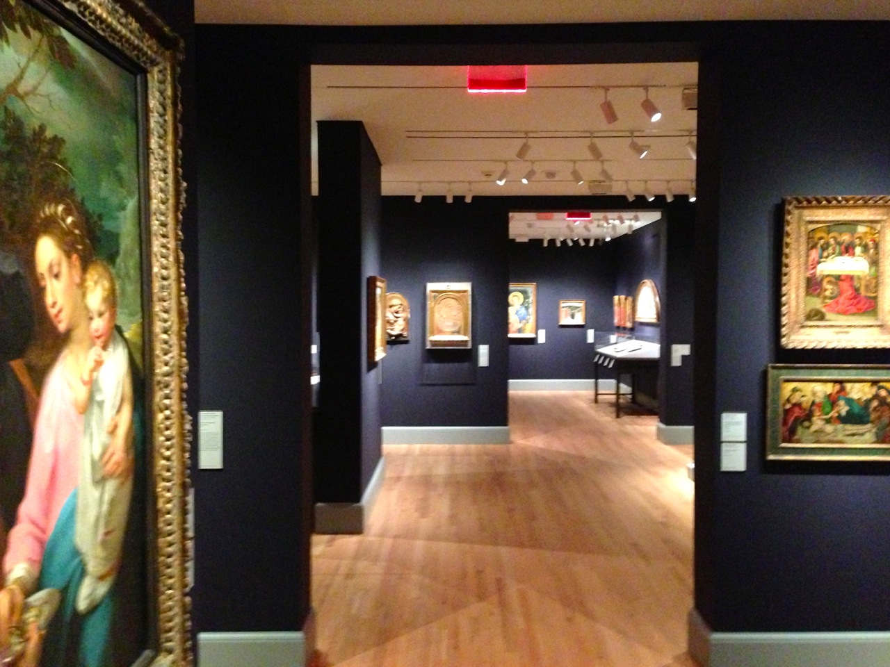
Newly refurbished European Painting Galleries in the Old Yale Art Gallery.
However impressive and public the collection, this is a truly educational institution in many ways.  They provide free brochures about the art, instructive wall labels in every gallery, and free lectures (usually about one of the current exhibitions, but also on other topics). They have a very extensive website; and there are smart, informative and enthusiastic guards and docents everywhere. There are also numerous classes for all ages taught on site, in front of the art. They even have a gallery devoted to a teaching collection, the Levin Study Gallery on the top floor of the new addition. All faculty members, not just those in the arts, can select and display work from the Yale collection to support a particular class. (For more about this, see Randy Kennedy's article in the New York Times.)

Of course, most educational are the exhibitions they organize and the scholarly exhibition catalogs they publish. During my visit, the main exhibition was  Société Anonyme: Modernism for America (until July 14, 2013). It surpassed even my high expectations. (Yale has another website devoted to the exhibition that uses Flash.)
One of the new galleries devoted to Société Anonyme: Modernism for America. 
The Société Anonyme was an organization founded in 1920 by Katherine Dreier and Marcel Duchamp with some additional help from Man Ray. It was America’s first contemporary art museum, and their mission was not only to collect and exhibit contemporary art, but to promote it and educate people about it. By the time they disbanded, they published about thirty publications, curated more than eighty exhibitions, and organized at least eighty-five scholarly programs — all to bring modernism to America.
Katherine S. Dreier and Marcel Duchamp in the library at The Haven, her estate in West Redding, Connecticut, 1936, shortly after Duchamp repaired his Large Glass in the foreground. 

It's entirely fitting that this should be their first exhibition in the new space because in 1941 Dreier donated almost the entire Société Anonyme collection to the Yale University Art Gallery — more than 1000 works by about 100 artists including such well-known artists as Constantin Brancusi, Paul Klee, Piet Mondrian, Joseph Stella, Max Ernst, Wassily Kandinsky, Fernand Léger, El Lissitzky, and Kurt Schwitters; and of course Marcel Duchamp and Man Ray; as well as lesser-known artists including one of my favorites, Louis Eilshemius. 
Louis Eilshemius, The Pool, ca. 1920, oil on printed sheet of music paper, laid down on laminated chipboard, 10 11/16 x 13 5/8  inches  (click to enlarge). 
And this surprise by an artist I didn't know — a 1920-21 abstract shaped painting:
Laszlo Peri, Room (Space Construction), 1920-21, tempera on composition board, 39 x 30 inches (Gift of Collection Société Anonyme).
After fourteen years and $135 million, three important buildings were restored and united, the exhibition space was expanded from about 40, 000 to 70,000 square feet, and the lighting and functionality of the museum was vastly improved. Good job, Yale. Now we'll have to see what Harvard comes up with in 2014 when additions and restorations to their three art buildings are supposed to be completed.

Friday, February 1, 2013

Matisse: In Search of True Painting

By Charles Kessler
Photograph of Henri Matisse by Robert Capa, 1949.
The Metropolitan Museum’s exhibition Matisse: In Search of True Painting doesn’t have nearly as much art as the one John Elderfield organized for MoMA in 2010, nor are there as many masterpieces. Elderfield's was a major retrospective — a once-in-a-lifetime exhibition. But in some ways the Met’s show is more enlightening. Roberta Smith called it  “… one of the most thrillingly instructive exhibitions about this painter, or painting in general, that you may ever see.” I agree.

The curator, Rebecca Rabinow, put together various versions of the same painting or subject so you can compare and contrast them (just like in a typical art history class). We are encouraged to focus on the changes Matisse chose to make and to witness his decision-making process. (And, unlike other blockbusters, this installation is spacious enough so it's possible to view several paintings at the same time without being blocked by other viewers.)

So, for example, on display are one full-scale drawing and two paintings of Matisse’s Le Luxe. The earlier works are not studies; they were created to stand on their own.
From the left: Henri Matisse, drawing for Le Luxe, 1907, charcoal on paper mounted to canvas, 88 9/16 x 53 15/16 inches; Le Luxe I, 1907, oil on canvas; 82 11/16 x 54 5/16 inches and Le Luxe II, 1907–8, distemper on canvas, 82 1/2 x 54 3/4 inches. 
From the drawing, to the first painting, to the final painting, Matisse progressively flattened shapes by eliminating modeling (the creation of the illusion of volume via the gradual shading of a shape from light to dark). So the torso of the crouching woman in the drawing, for example, gets gradually darker as it curves away from the source of light. In  Le Luxe (center), the modeling is schematic, less gradual — a splotch of light, warm color closest to the light source, and unmodulated cool color away from it. The Le Luxe torso thus becomes less solid and volumetric than in the drawing. And finally Le Luxe II is flat, no modeling — and the torso appears even less solid, less rounded. 

This is basic stuff, I know, but to see it set out like this is a surprisingly visceral experience. It was trilling to see how color becomes free of solid form allowing it to pulsate, breathe and glow in airy color/space. (And because of the flatness of the shapes, their abstractness, the way they are frontal and pushed up to the picture plane, Le Luxe II takes on a mysterious, allegorical quality.) 

A similar development is seen over and over, most instructively in gallery 7 where three paintings are presented with photographs documenting their evolution. 
Two walls of Gallery 7 showing photographs documenting the evolution of Matisse's La France,1939 (Hiroshima Museum of Art, Hiroshima, Japan) on the left, and Still Life with Magnolia, 1941  (Musée National d'Art Moderne, Centre Georges Pompidou, Paris, France) on the right.
Beginning in the 1930s, Matisse hired the photographer Matossian to document the progress of some of his paintings when Matisse felt they had arrived at a significant stage. According to Matisse's model and studio assistant Lydia Delectorskaya, Matisse would use the photos to evaluate and rework a painting in order to, as he put it, "push further and deeper into true painting." 
Gallery 7 showing Matisse's The Dream, 1940, along with photographs documenting the painting's evolution.
In December 1945, six paintings and their photo documentation were displayed at the Galerie Maeght in Paris. Matisse wanted to demonstrate that his paintings weren't casual and spontaneous but rather were hard-won struggles. The Met recreated three of the walls from that exhibition. 
Henri Matisse, The Dream, 1940, oil on canvas, 31 ⅞ x 25 ⅝  (private collection).
Four of the fourteen photographs documenting The Dream at different stages. 
You can see Matisse struggle with The Dream, which he worked on for almost a year. He began with a relatively representational depiction of a woman sleeping — a figure with volume and weight, inhabiting a relatively rational space. Later photos show Matisse adding more detail, more modeling and more rhythmic brushwork and ornamentation; then the photos show Matisse focusing in. There is less and less detail both in the background and the figure, and the composition is ultimately simplified down to a play of oval shapes. 

The evolution of the woman's arms is a good example of Matisse's process. In the earlier work they project forward, out of the picture plane, toward the viewer; in the later work, they are flat vertical oval shapes parallel to the picture plane. 

The exhibition reveals Matisse's process in other ways as well. There are several paintings of the Cliffs of Étretat that Matisse made in 1920, along with an early photo of the actual site.
Henri Matisse, three versions of The Cliffs of Étretat from 1920. 

Photograph of the Cliffs of Étretat, ca 1906.
And there's the actual dress worn by Lydia Delectorskaya in Matisse's The Large Blue Dress, 1937. According to the Met's exhibition website, "She made it herself, using silk in the artist's favorite shade of blue and adding a cotton lace-trimmed ruffle to create the illusion of an overskirt." (It's surprising to me that Matisse chose not to go with his "favorite shade of blue," since the blue in the painting is kind of pallid.)
Blue Dress Gallery
Left: Henri Matisse, The Large Blue Dress, 1937, oil on canvas; 36 1/2 x 29 inches (Philadelphia Museum of Art); Right: Matossian documentary photograph of an earlier stage of The Large Blue Dress, February 26, 1937, 5 3/4 x 4 1/2 inches (Philadelphia Museum of Art).
Lastly, another thing I liked about this exhibition, and I hope it becomes a trend, is the way the space was designed. Rather than an overwhelming, vast, monolithic series of galleries, one after another, the eight spacious galleries are all different sizes, heights and colors. As a result, the exhibition is broken up into doable bite-sized chunks, and each new space refreshes the spirits.